I needed a new TV stand and found this super cool vintage buffet from Craigslist that fit the bill. I even found a party planning guide stuck behind the drawer from the 50's! Honestly, I buy almost all of my furniture from Craigslist and then rehab it. They just don't make furniture with the same quality wood anymore.
Here are the before pics of the buffet.
Because my living room currently is pretty neutral as far as color, I have been dying to experiment with a statement piece. Something really bright and different looking. The decision: paint it bright Kelly green and then glaze it to look more distressed. Think Southeast Asian style. I have never glazed before and knew that I was in for a challenge.
First step: paint the buffet green.
Honestly, I could have just left it green. It looked really fun, but I was determined to glaze it and was curious to see how it worked out.
I ended up using these blog instructions as a guide: http://realitydaydream.com/furniture-glazing-tutorial/.
Overall the glazing technique was tough for someone like me who is a bit of a perfectionist. Who knew that creating a "messy" antique look is actually hard? I found it tough to make it look natural and ended up going back with a fine brush and adding some additional glaze within the cracks and details for added emphasis.
I am not going to lie, it took me a little while to get over the fact that the finished product looked "dirty" to me and now I am really happy with it. I think it added some much needed pop to our living room.
Takeaway: glazing is not as easy as it looks. Ok, let me clarify: it is easy. It is hard to make LOOK good.
On to the next thing!
This is my attempt to document what is sure to be the crazy journey that is the renovation of Jeremy and my new house. Enjoy the ride!
Thursday, August 11, 2016
A little Pinterest Pizazz
I am a typical woman: I browse Pinterest here and there and pin items that look cool though even if I never actually plan on trying them. We needed a headboard for our guest bedroom and I had saved this pin a while back:
https://www.pinterest.com/pin/94012710947589290/
My mom later asked if we wanted some of their old fence posts, as they were replacing theirs and this pin immediately came back into mind.
I started by sanding all the boards down just to get them smooth, though I didn't bother trying to make them look perfect because that defeats the purpose of the distressed look!
The next step was staining. I am personally not a huge fan of the white-washed look, which is what is shown in the pin, so I decided to go with a nice chocolate brown stain instead. Enter my new favorite product ever.... Polyshade! Polyshade is god's gift to DIY-ers everywhere. It is a combo of stain and polyurethane. With a couple of coats, you are good to go!
I was really happy that the natural "distress" of the boards were that much more emphasized by the Polyshade and they ended up looking amazing.
Once all the boards were stained, I screwed them into 2 x 2's so that the end product was nice and sturdy. Oh yeah, and I also staggered the boards (true to the Pin) in order to make it look a little more interesting.
Overall this Pinterest project worked out really well. I have received a ton of compliments about the finished product and plan to hang on to it for a long time.
Note: the only thing worth mentioning is that the Polyshade smell is pretty intense. We needed to open the windows to the guest bedroom and let the smell air out for several days before I would have felt comfortable spending a lot of time in there.
Can't wait to try another Pinterest project soon!
Patio and Entryway
Ok, so it has been almost a year since I posted anything on this blog which is unacceptable in my mind. If anyone is actually reading this... sorry about that!
We have done some fun stuff around the house and I am going to do my best to catch up on the stuff that I haven't posted yet. One of the first things that we knew we wanted to work on was the entryway. It was an ugly linoleum tile that was stuck to the wood floor. Now that is just a travesty. Because we have a living room the shape of a rectangle and the entry walks right into the living area, we wanted to extend the size of the "entry" and make it seem slightly more legit.
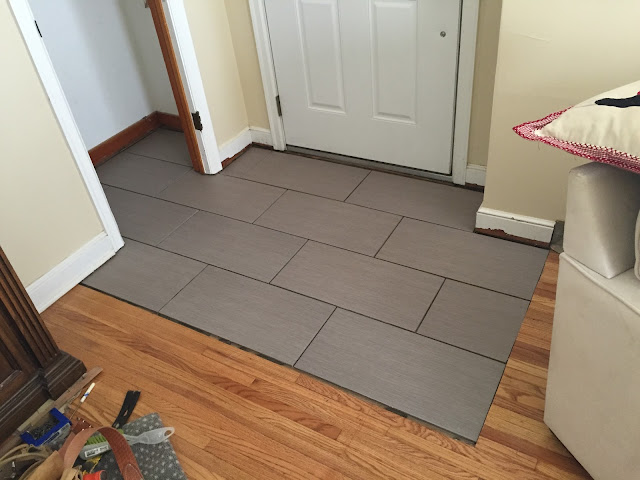
Jeremy cut out some of the wood floor so that we could set the tile right on the sub floor. We decided to go with a modern looking gray porcelain tile. Some people get confused regarding floor tile choices but porcelain is actually stronger and more durable than ceramic tile. It is a great choice for high traffic areas.
Here is a picture of when we had just laid the tile down.
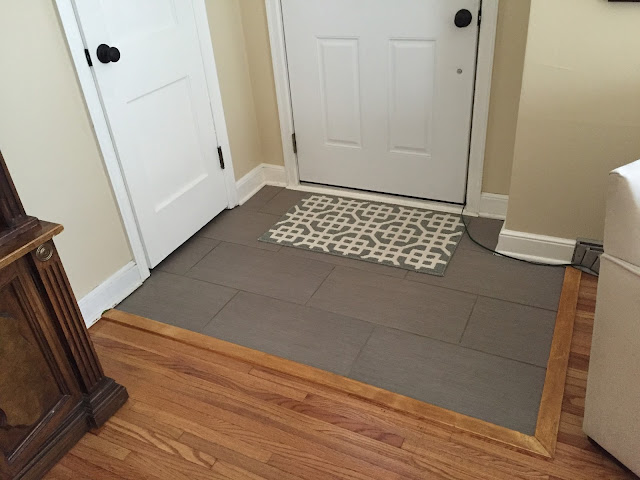
Here is the final product.
You all have no idea how hard it was for me to try and match the trim that we put down with the rest of the living room floor. It took a lot of experimenting and several different stain colors. I think I finally got it looking pretty close!
On to the patio. We wanted a spot other than the deck that would work for a lounging area and allow a station for our fire pit. Jeremy was able to create a nice area and extend the pavers around the stairs to the deck. Check it out!
Once we add some landscaping around the patio, we will have a nice little sanctuary!
We have done some fun stuff around the house and I am going to do my best to catch up on the stuff that I haven't posted yet. One of the first things that we knew we wanted to work on was the entryway. It was an ugly linoleum tile that was stuck to the wood floor. Now that is just a travesty. Because we have a living room the shape of a rectangle and the entry walks right into the living area, we wanted to extend the size of the "entry" and make it seem slightly more legit.
Jeremy cut out some of the wood floor so that we could set the tile right on the sub floor. We decided to go with a modern looking gray porcelain tile. Some people get confused regarding floor tile choices but porcelain is actually stronger and more durable than ceramic tile. It is a great choice for high traffic areas.
Here is a picture of when we had just laid the tile down.
You all have no idea how hard it was for me to try and match the trim that we put down with the rest of the living room floor. It took a lot of experimenting and several different stain colors. I think I finally got it looking pretty close!
On to the patio. We wanted a spot other than the deck that would work for a lounging area and allow a station for our fire pit. Jeremy was able to create a nice area and extend the pavers around the stairs to the deck. Check it out!
Once we add some landscaping around the patio, we will have a nice little sanctuary!
Subscribe to:
Comments (Atom)


